
Matchy-Schmatchy…How to Match Patterns Without Being Wacky-Tacky!
You know what they say, everything old is new again. But let’s be honest, some things are better off kept in the past. Remember the 60’s and early 70’s (maybe you can’t “remember” it), pattern on pattern was groovin’ baby.
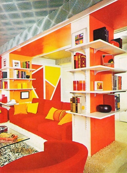
Bold colors, overstated lines and shapes, psychedelic, groovy, Peter Max to the max! The effect was over the top. We embraced the look, but today’s approach to interior design takes a more refined thinking regarding how color, pattern, even texture work together to create an appealing, not mind blowing room vista.
I’m fascinated by blending patterns and textures. My look has always been “safe”. The biggest risk I even took was red trim on a green wall. And for the record, it didn’t work. I want to try this! and with a new home and a blank canvas, I’m vibrating with ideas!
But it’s scary, risky. And I know, it scares you too, especially if you’ve experienced design catastrophe too. But you can do this. WE can do this and discover our inner artist.
With a few simple tricks and tips and the BFS Design Wall, you’ll be matching like a pro without risk of being wacky or tacky.

If you’ve been a quilter for any good amount of time, pattern matching is like breathing for you. But we’re not going to dig into quilting today. I mention it only because as an art form, we can take some direction from what our predecessors did as we explore contemporary design practices. These guidelines are a great jumping off point to hopefully engage and inspire you to try this out. If you’re game, I guarantee you’ll make your living spaces come alive with the rich array of fabrics available from BFS.
Rules…Schmules
I don’t like rules. They were made to be broken. But I do appreciate when there’s a take-away, something I can immediately try at home, after I read something.
I also like take-out…
Take-Away #1 Trust Thyself
I say this first because if you can’t do this, you’ll never take a risk. Think of it like getting a major haircut. The first cut is the hardest. And let’s face it. hair grows. So really, there is not risk. Trust me, it’ll grow. You know what you like; most people do. And like most people, you can with good faith, make a good decision on what is pleasing and what is not. So don’t sweat it. It’s all good.
Take-Away #2 Be an Oddball
Yes, be the odd man out. Embrace the third wheel!
I’ll clarify. Odd numbers have a certain symmetry. The same is true whether staging a display or choosing solids and multi-colors that work together. Three is the magic numbers. Ever wonder why a living room set is usually three pieces? Two is not enough to create an effect, and four or more is just visual overkill. Three, is the perfect trifecta. There’s actually a science to this rule. It turns out, our brains love to create order out of chaos. Who knew! So when items are arranged in threes, our brains can make a distinguishable pattern out of it. So the effect is not only visually pleasing, but creates depth in color and texture.
Schlamazing…
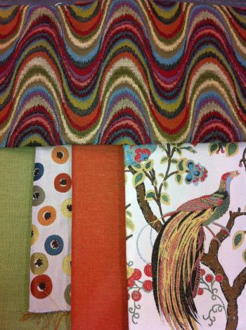
So If we’re going to be successful at this little risk endeavor, we have to stick to the rule, even though we’re rebels and want to break it. Make it a perfect trifecta: a stripe or geometric, a pattern, and a solid, and it’s a win-win.
Here’s what I mean.
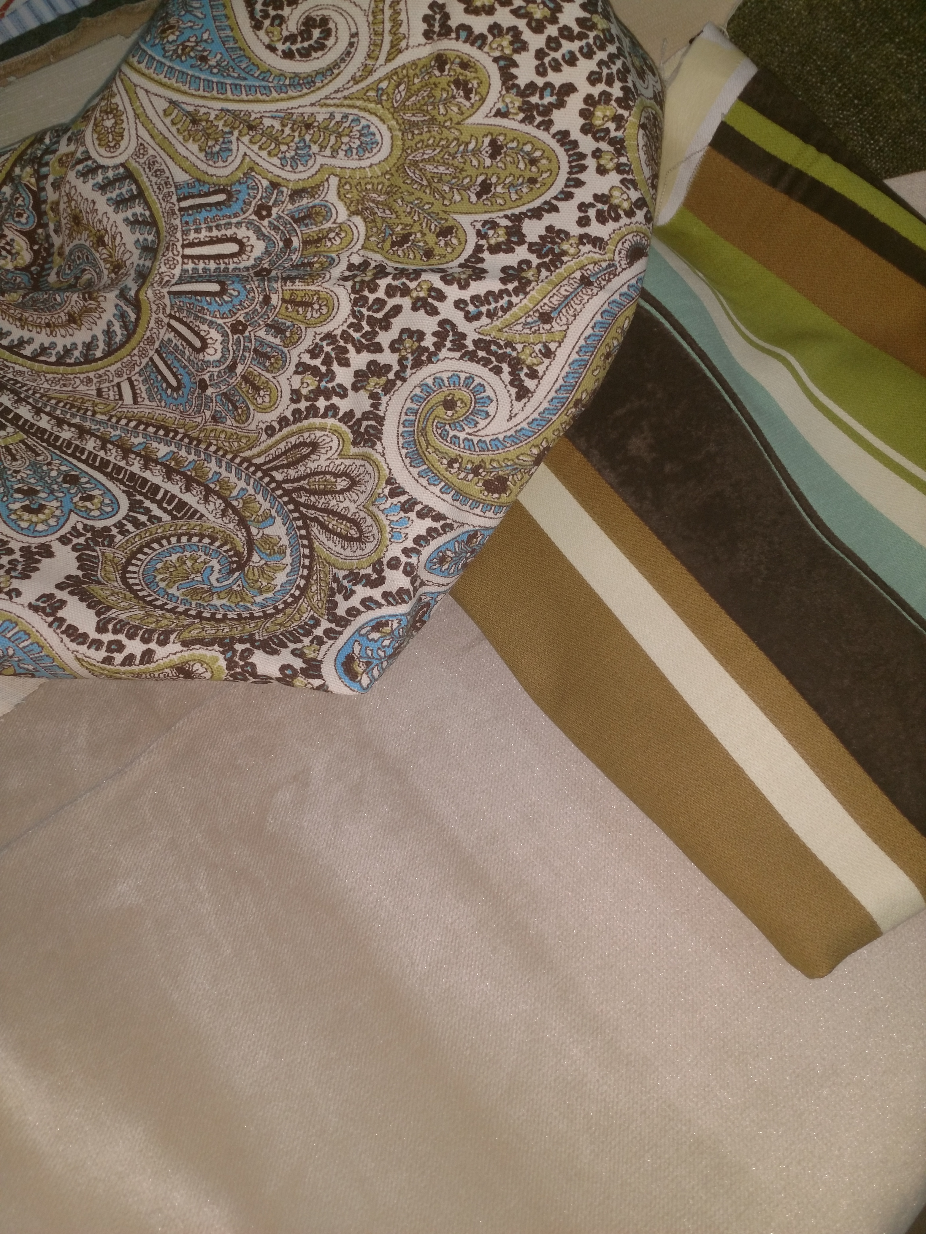
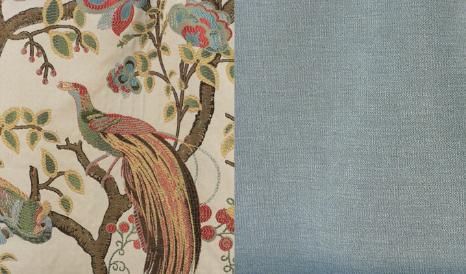
I love fabric with texture. Paisley Chocolate/Natural is both visually textural as well as being a corduroy. I paired that with Marquis Driftwood and Bella Velvet Linen. All three have a soft texture. Texture is in many ways, like a carrier oil. The essential oils are carried by the heavier olive or almond oil. It brings the perfumes together. Texture can also heighten certain colors in a muti tone “solid”, such as in a tweed. In this example, the texture of the Paisley Chocolate makes the colors pop rather just lie flat.
Take-Away #3 All Tied Up
In the Rule of Threes, you have to have a silent partner, that’s the solid. Whether on the back of a chair, paint onta wall or an accent pillow, the solid binds both patterns together by picking out a dominant color to play on. Imagine this as a chair with a contrasting pattern on the seat and back accented, yes accented with a solid pillow. Note the geometric or stripe with the floral or botanical print. It’s the solid that makes it work with, not against itself by creating something, well, solid to focus on.

Take-Away #4 Focus Pocus
Speaking of which, it helps to start with a focal point.
Admittedly, I struggle with interior design, particularly when starting from scratch. I get a lot of compliments on my front porch from my former home in Illinois (I am now a proud Alabama transplant!). And now, with a “new” to me house, I have no real focus because we sold much of our stuff prior to moving. So you can imagine that I’m feeling a bit glassy eyed with my design dilemmas!

Here’s my newest “focal” point! Please comment if you have some design inspiration for the rest of the house which is currently on paneling overload.
Ewwww.
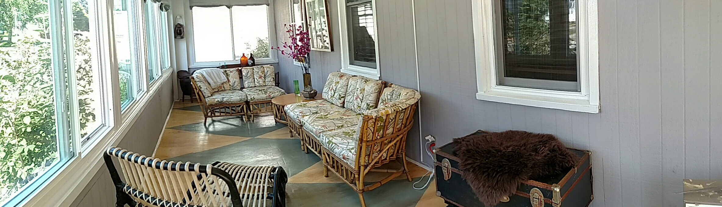
I loved showing off this porch. Friends and visitors would tell me I was so good at interior design. Here’s my confession. The reason the porch worked isn’t that I’m a wiz-bang at design, it was for the simple fact that I had a focal point; I started with the furniture that was already done. I already knew I wanted to do a patterned floor, so from there, color was the biggest decision to make.
Which brings me to
Take-Away #5 and #6 The Scale is Your FRIEND and Florals and Shapes Make a Happy Marriage
So I know I said rules are meant to be broken, but #5 is a big one. Keep pattern scale big on big and small on small. In other words, don’t put a giant, bold pattern on a small side chair or a foot stool. In the same vein, a tiny pattern or thin stripe over a large area not only becomes monotonous, but it can even become visually mesmerizing or dizzying as your brain tries to make sense of so much over so great a space.


So while the focal point started with the furniture, it was the floor which ended up taking the center stage. And I like that! Not only did I labor over it, it was an unexpected surprise and a lesson. The play off color in the floor, both the blue and the distressed yellow in the background, plus the geometric shape against the traditional floral is a very happy marriage indeed!
In this example, It seems like a busy match. But put the solid with it, and the eye sees the focal color, not the pattern on pattern. Now, with this collection, I would caution you to think carefully about placement. I would recommend not putting the geometric and the botanical print side by side without breaking them up with the solid. I’ve presented this combination to show you how you can use unlikely duos.
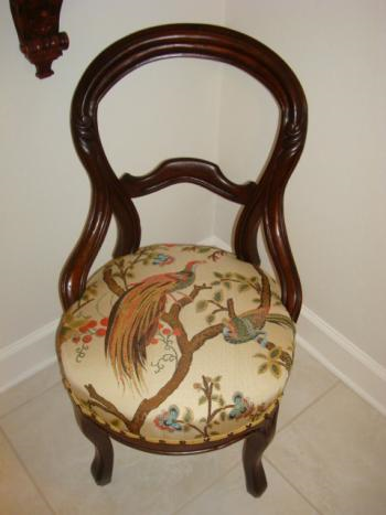
Because the botanical is so bold, this would be a good choice for drapes. Even though it’s a large print, this would also work well as an accent pillow for the fact that you could carefully select parts of the pattern to be front and center on a pillow, a chair seat, or perhaps a footstool. I know I said big on big and small on small. The Phoenix print is one of those exceptions. Take a look.
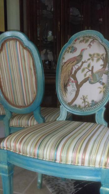
In these examples from our gallery of customer projects, note the use of the stripe against the Phoenix and how the customer used a clipped section of the pattern only as the focal point and pulled in a solid by painting the chair. Great use of pattern a texture!
Good Plan #7 Two Brights Do Not Make it Wrong
Clearly, I love Phoenix Jewel, I mean, what’s not to love about this gorgeous jacquard that comes in multiple colors! So we’re going to continue using it as an example because of its bold pattern and textures. This customer has picked up on bold colors and shapes to highlight the focal point of the Phoenix. While she chose very bright in the “stripe”, it works so well with this because of the color play. I would choose the stripe over the dot and go with the green as a solid. By using color in a playful way, it actually heightens and exploits (in a good way), the striking color, texture, and pattern in the Phoenix Jewel.
Take-Away #8 Let Your Chrome Dome Shine…Use Print in a Monochrome Setting
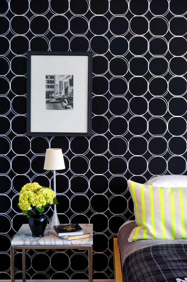
As a general FYI, pulling off a monochrome interior design setting is not easy if you’re afraid of color. It’s a design trend currently, so expect to see black and white themed environments, for example. Grey is the new beige. The simplicity of monochrome is that it’s literally a blank slate. So if you’re looking to go monochrome, use texture and pattern to your advantage. You have ample opportunity to go bold with a accessory such a bright patterned pillows or side chairs. If you’re using pattern as part of your monochrome, such as a black and white print, your color accent choices are limitless. You can even bring in a little texture by using tone on tone. Here, I’ve shone how Juno Ebony and Polka Dot Black against the Regency Gunmetal Damask marry shape, color and texture together to create interest where bright color is not present.

But, use a different color such as the Robert Allen Folk Textural Coral and it’s a whole different story!

Take-Away #9
Not really a take-away, but worth mentioning. I’ve shared my thoughts on how to follow this design trend successfully. I think it’s beneficial to briefly look at as what Stacey and Clint used to say, what NOT to wear. In 2017, Elle De or put out a fantastic blog on design trends that needed to go peacefully into the past. To be honest, a couple did surprise and convict me. To read the entire blog, go to Elle Decor.
Here are a few examples of what not to do.
Flower Power Killer is like design Krytonite for any design superhero. This was a trend that needed to die even before it lived. There is just too much going on and nothing whatsoever tying this together. I’m not even sure we could salvage any of this look.
On a first glance, Mean Green Overkill Machine could work. And it can, with a few changes. First problem is the overuse of pattern. This design enthusiast has made a faux pax, excusez moi. Matchy-matchy on the valance/drape could be updated with the stripe from the armchair either on the valance or the drape. Although it’s difficult to really see, the pattern on the couch and armchair would do better pulling in the stripe and if the additional pattern was to be used, accent pillows could work with this fabric since it’s a subtle pattern.
Mean Green Overkill Machine
Oh the musty, dusty, muted (mutant) pastels of the 80’s. Don’t even dust them off. They just gotta go. Nothing more to say. Nothing worth saving here. It just looks sunbleached.
Thanks to Elle Decor for some great information on trends. For more on draperies check out their foollowup article then come back and do some shopping with us!
So to wrap up…
It’s really a no brainer. #1 Rule, and the only real rule, trust your instincts. If you’re a newbie like most of us, start with a monochrome. It’s the easiest and safest way to go. You really can’t mess it up. Less is more and well more is…more.
Remember, use the Design Wall. I can’t stress enough how helpful it is. You’ll save time and possibly money by seeing your ideas work together so you can refine your ideas without ordering samples willy-nilly. Not that I want to discourage you from ordering samples, but I prefer to order only what I need in order to assess weight and actual color.
Now go have some fun!
Sew ‘n piece my friends!

